HAILO
A REDESIGN LEADING to 15% Increase in bookings.
Key Highlights
-
Design Lead
I led the complete redesign of the Hailo passenger app.
-
15 % Increase
After launching the redesign, we saw a 15% increase in bookings.
-
2x Higher End Cars
Doubled the number of times a premium car (ie more profitable) was selected.
The current design did a great job for Hailo finding product-market fit.
But as we explored how can offer different service types with clear communication on pricing structure, and offerings, it became clear the current design was too rigid.
WHY DO A REDESIGN?
People like choice but really want to get from A to B quickly in a hassle free way.
People like to know how much they are paying but not all want the cheapest option.
Promptness is important, but more important is not feeling ripped off.
START WITH THE USER
we started with research and three key points stood out:
Build a UI that can deliver multiple service types.
Create an experience where the user can compare services and make clear decisions based on ETA, pricing and availability.
Design for flexibility and for future developments and cool features like Pay with Hailo.
And finally don’t break the two tap simple Hailing experience that we have today.
DESIGN GOALS
Delivering on choice and transparency was the goal. It became clear the old design would not allow this. We landed on these design goals:
We did a ton of sketching and testing to land on the right ideas.
We would take these ideas, mock them up in Sketch and test with users. We averaged roughly 10-15 user tests a week.
EXPLORATION & PROTOTYPING
We wanted to tap into what made Hailo a product versus our competitors. We didn’t want to be another car hailing app. This came down to:
Price and time transparency.
We needed to be clear on how much you’ll pay and when the car will arrive. Most importantly we didn’t want the user to feel like they got ripped off.
Defining Hailo As A Product
EARLY PROTOTYPES
We made a ton of prototypes working through the interaction design. This video show an early interaction design that formed the base of our design.
The current UI was cluttered. Our goal was to add more but also simplify and make the product feel lighter, cleaner, and simpler.
This came down to:
Reduce
Prioritize
Organize
SIMPLIFYING THE UI
Before and After simplifying the UI
Getting Nitty And Gritty
Next: nailing the details of the UI. This meant thinking through all the little interactions and use cases.
We hid a few options partially out of sight, hinting to their existence using a peek-a-boo animation during a screen transition.
This tested well with users and led to us taking a similar approach to other areas of the app to ensure a clear focussed UI throughout.
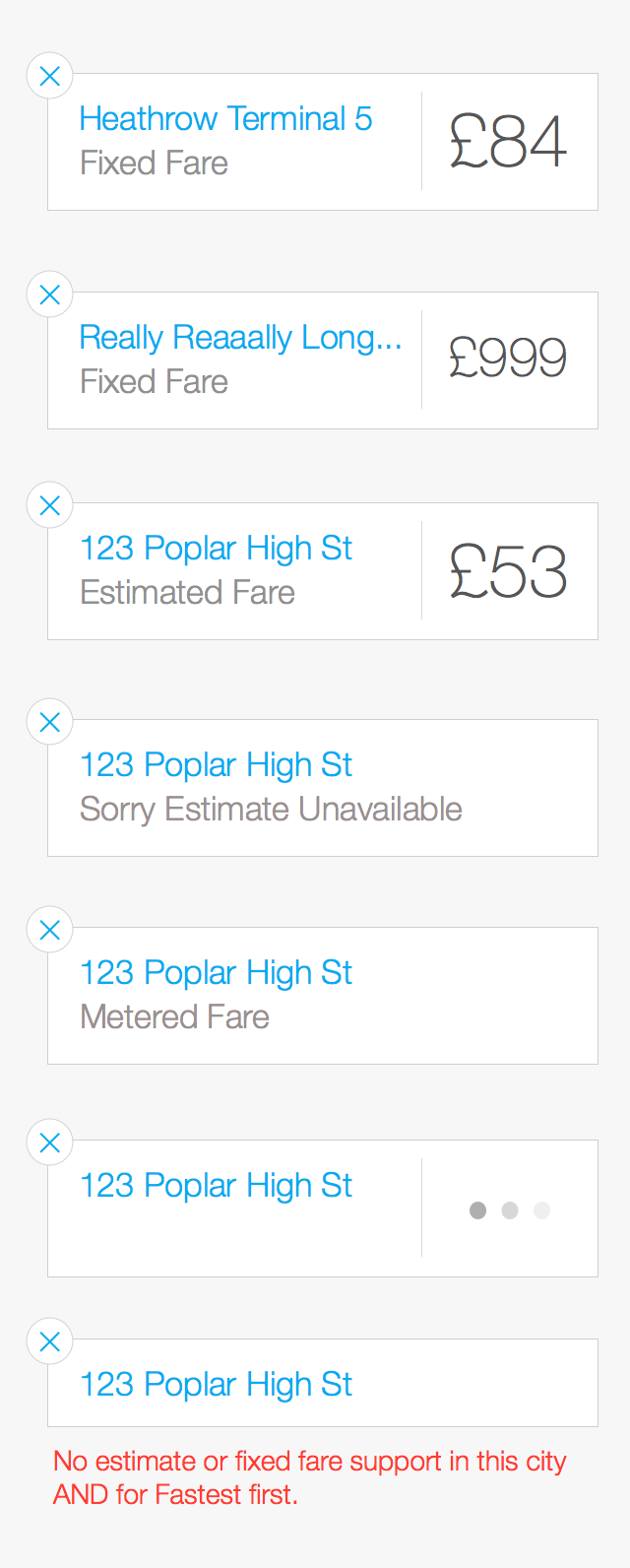
At this point we needed to detail out all the use cases and nail the details of the UI. Below are a couple examples of what that would look like.
UI DETAILS


Throughout the process we played with varying color, typography, and layouts in our wireframes and prototypes. This was our way of playing with the branding to see what really resonated. Eventually we landed on a color and typography scheme we felt great about.
BRANDING
User Testing In The Office
We tested early prototypes in the office with users.
User Testing In The Real World
We went outside, found people who are hailing cabs (are potential customers), and offered them credit for 15 mins of their time to test the app.
Dog Fooding
The product team used an internal app as their Hailo app. We collected feedback and bug reports to help steer the design and development
TESTING
Testing was key to making sure we were on the right path so we did this 3 ways:
The initial results were a 15% increase in bookings. Below are screenshots of the final release.


